
By [Beliving], Interior Designer
Color is more than just decoration—it’s emotion. The colors we surround ourselves with can dramatically influence our mood, energy levels, focus, and even how we experience a space. As an interior designer, I use color psychology not just to beautify a room, but to shape how it feels to live in.
Here’s how you can use the power of color to transform your home into a space that supports your lifestyle and well-being.
1. Blue: Calm, Focused, and Serene
Blue is known for its calming effect, making it ideal for bedrooms, bathrooms, and home offices. Soft sky blues promote relaxation, while deeper navy tones can add sophistication and focus.
Best for: Bedrooms, bathrooms, meditation spaces
Pair with: Whites, greys, warm woods for balance
2. Yellow: Bright, Energizing, and Cheerful
Want to add joy to a room? Yellow evokes warmth and optimism. It’s a great choice for kitchens, breakfast nooks, and any space that could use a lift. But use it carefully—too much can feel overwhelming.
Best for: Kitchens, dining areas, entryways
Pair with: White, muted greens, or soft greys
3. Green: Balanced, Natural, and Refreshing
Green represents renewal and balance. It brings the outdoors in and creates a sense of tranquility and grounding. From sage to emerald, green works beautifully in almost every room.
Best for: Living rooms, bedrooms, home offices
Pair with: Neutral tones, brass accents, natural textures
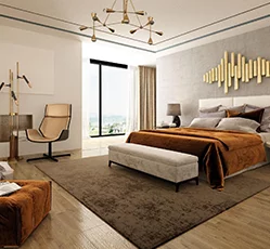
4. Red: Passionate, Bold, and Energizing
Red stimulates energy and conversation, making it great for dining rooms and social spaces. However, in large doses, it can be overwhelming—so use it as an accent or in deeper, moodier tones.
Best for: Dining rooms, accent walls, powder rooms
Pair with: Gold, charcoal, or dark wood finishes
5. Neutral Tones: Timeless, Sophisticated, and Versatile
Whites, greys, beiges, and taupes create a serene backdrop and allow your furnishings and décor to stand out. They also make spaces feel larger and more open.
Best for: Any space
Pair with: Literally anything! Add pops of color with art or textiles.
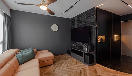
6. Black: Elegant, Dramatic, and Grounding
Black adds instant sophistication and drama. Use it to ground a space or highlight architectural features. Even a black ceiling or door frame can add depth and modernity.
Best for: Bathrooms, accent walls, kitchens
Pair with: Whites, metallics, bold colors
How to Choose the Right Colors for Your Home
Consider the room’s function: Do you want to relax, work, or entertain here?
Think about natural light: Darker colors absorb light, while lighter shades reflect it.
Start with a base: Choose a neutral and build your palette around it.
Test before committing: Paint large swatches on the wall and observe them in different lighting.
Final Thoughts
Color is a language. It speaks volumes about who you are and how you want to feel in your home. Whether you’re repainting a single room or redesigning your whole space, let color psychology guide you to choices that support beauty and well-being.
Need help crafting the perfect color palette? I’d love to help you bring your vision to life—book a consultation today!